
Graph neural networks are all you need
Graph neural networks are one of the hottest topics in machine learning in 2023.
With applications ranging from DeepMind’s award-winning AlphaFold to Google Maps to Netflix’s state-of-the-art recommendation system, graph neural networks are everywhere. This article aims to present the concept of graph neural networks on an abstract level.
We begin with the motivation behind graphs and then build on that intuition to introduce the foundational concepts behind graph neural networks. The concepts covered in this article are accompanied by Python code for you to tinker with.
To follow along with the code, you should have a basic understanding of Python programming. Knowledge of PyTorch will be a bonus.
- Why graphs all of a sudden?
- Mining graphs in Python
- Graph neural networks: An introduction
- Basic ingredients of a GNN
- Graph representations: Under the hood
- Designing your first GNN
- Graph neural networks using PyTorch Geometric (PyG)
- Zachary’s karate club
- Creating the PyTorch Model
- Going forward
- Conclusion
Why graphs all of a sudden?
Before we understand why graphs are so imposing in the field of machine learning and computer science in general, let’s do a small review of the graph data structure.
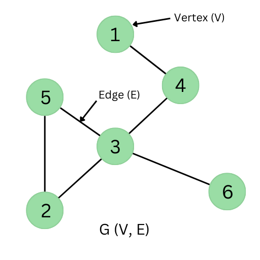
In layman’s terms, a graph (G) is a collection of nodes/vertices (V) connected by edges (E). The nodes in a graph generally represent specific points of interest while the edges that connect the two nodes specify the relation between our two points of interest.
The graph is a very generic data structure since the characteristics and properties of nodes and edges can easily be modified according to the problem at hand. Here are some examples from real life where we can easily use graphs to represent the data.
Let’s start with a simple example: a small friend circle.
In this friend circle of A, B, C and D, A is a friend of B, B is a friend of C, and D is a friend of A. Representing this relation as a network (graph), we get:

Consider another example of cities and routes, where three cities — X, Y, and Z — are interconnected by roads. This relation between cities can also form an interesting graph:
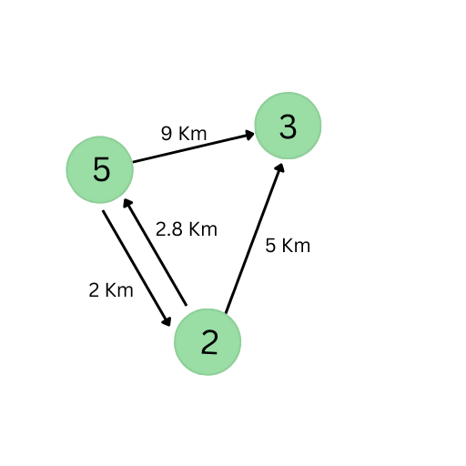
Notice how this graph is different than the first one:
- The edges have weights, which indicate the length of the road. Graphs with weighted edges are called weighted graphs.
- The edges have a sense of direction (i.e., the edges are pointed from one node to another). Graphs with directed edges are called directed graphs.
- It’s also a multi-graph — a graph where nodes can have more than one edge. This implies that a graph can have multiple edges that have the same end nodes.
Now, let’s review a very simplified version of a movie recommendation system. A subset of the data would look like this:
- Show 1 is related to show 2 and show 5.
- Show 5 is further related to shows 3, 7, and 8.
Let’s have a look at the graph representation of this data:
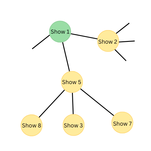
So, for someone who watches show 1, our recommendation engine will recommend shows 2 and 5.
Note: In real-life datasets, nodes usually contain more information, like genre, rating, etc. as a feature vector or embedding which, when combined with user information, makes recommendations much more accurate. It’s also important to remember that the edges can contain information about the link between two nodes.
We see how data with varying levels of complexity can be represented/mined very conveniently with little to no loss of information. Previous data representation/mining techniques tend to simplify these graph structures and represent them in a tabular form (which is not the natural form of the data). Even though simplification leads to a loss of information, tabularization was an essential step to reduce the complexity of the data, therefore reducing computations to make the training/prediction on data more feasible. At present, with significant advancements in hardware and algorithms, people are increasingly motivated to use graphs for data mining.
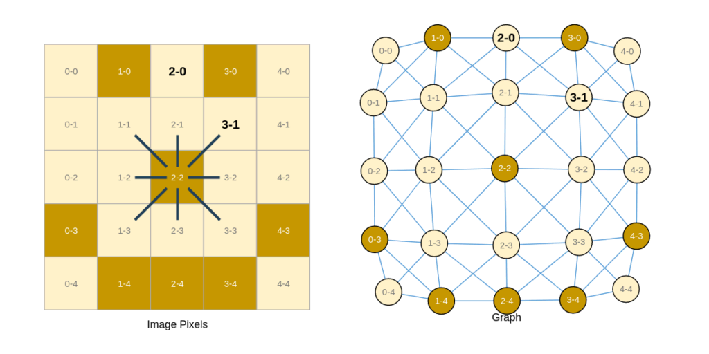
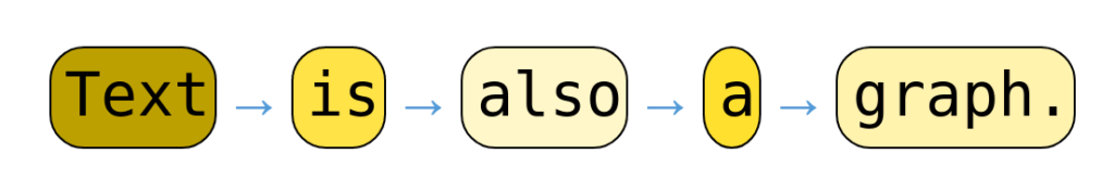
There are more fascinating aspects about graphs, too. For example, graphs can be considered as a superset of image and sequence data:
- Images are a matrix of pixels. We can reimagine them as a graph of pixels (as nodes) that are directly connected to their neighboring pixels. To gain more insight into this idea, refer to Figure 5a below.
- Similarly, sequential data can be represented as nodes connected to the previous and following node (if present). Figure 5b illustrates this concept of converting a sentence into a graph.
For more interactive visualizations, I would strongly recommend this article by members of Google Research. Now that we have a fair amount of intuition behind graph data, the obvious question arises: How do I store graphs in computer memory? This is precisely what we’ll explore in the next section.
Mining graphs in Python
Storing data in a digital form is necessary for performing any computations. There are many ways to store graphs. In this article, we’ll be mining graphs using the Python programming language and the NetworkX library. You can use this colab notebook if you want to run the code in the cloud.
If you want to set up the code locally, the following instructions will help you create a virtual environment with correct dependencies:
1. After opening the terminal inside the project folder, create and activate a new virtual environment.
python3 -m venv .venv
source .venv/bin/activate # activate the virtual environment
This instruction for creating venv is only applicable for UNIX-based systems. If you are using Windows, please refer to the original documentation of venv.
2. Install the required libraries in the local venv — not in the global Python environment.
python3 -m pip install networkx==2.8.8\
                       plotly==5.5.0\
		pandas  nbformat matplotlib
We can always use the latest version of libraries, but we recommend using these specific versions to avoid any possible discrepancies in the future.
Note: If you are using Anaconda for Python, follow the official instructions to create a virtual environment and install the required dependencies.
The NetworkX library has an intuitive and easy-to-use API. Here’s a simple code to represent the graph in Figure 6:
import networkx as nx

# Import plotting libraries
import plotly.express as px
import plotly.graph_objects as go
import matplotlib.pyplot as plt
# Create Non-directed Graph
G = nx.Graph()
G.add_node(1) # Add one node to the graph
G.add_nodes_from([3, 4]) # Add some nodes from a list
# Add edges between nodes
G.add_edge(1, 3)
G.add_edge(3, 4)
# Finally let's draw the mined graph
nx.draw(G, with_labels = True)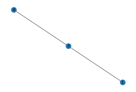
Note: NetworkX uses Matplotlib under the hood for plotting the graphs. This means you can apply normal Matplotlib functions to NetworkX plots.
This example demonstrates the most basic functionalities of NetworkX. We can go deeper by enriching our nodes and edges with more features.
Let’s discuss another situation where we have four cities in the USA with their coordinates and the distance between them. First, we create the graph:
 Create an undirected graph on the assumption no highway
# connecting these cities are one-way
map = nx.Graph()

# Add cities with coordinates
map.add_node(0, name = "New York", location = [40.7128, -74.006])
map.add_nodes_from([

#

         (1, {"name":"Chicago", "location": [41.878, -87.629]}),
                    (2, {"name":"Washington D.C.", "location": [39.907, -77.036]}),
                    (3, {"name":"Boston" , "location": [42.360, -71.058]})])

# Nodes of the graph
nodes = list(map.nodes(data=True))

print(nodes[0])
(0, {'name': 'New York', 'location': [40.7128, -74.006]})Let’s add some edge features.
# Add the edges of the graph
# The edges of the graph are the distance
# between two cities

map.add_edge(0, 1, distance = 790.1)
map.add_edge(0, 2, distance = 239.1)
map.add_edge(0, 3, distance = 216.1)

map.add_edge(1, 2, distance = 701.4)
map.add_edge(1, 3, distance = 983.8)

map.add_edge(2, 3, distance = 437.7)
Next, let’s see the position of the nodes on the world map. We will be using the Plotly Python Library, which can be used to make interactive graphs. Here, we’re using the Scattermapbox function from Plotly Express to mark the location of the cities given their latitudes and longitudes.
# Get city_names, latitudes and longitudes from the graph
city_names = [node[1]['name'] for node in nodes]
lat = [node[1]['location'][0] for node in nodes]
lon = [node[1]['location'][1] for node in nodes]

# position the image
fig = go.Figure(go.Scattermapbox(
       lat=lat,
       lon=lon,
       mode='markers',
       marker=go.scattermapbox.Marker(
           size=15,
           color='#fa2925'
       ),
       text=city_names,
   ))
fig.update_layout(
   mapbox_style="outdoors",
   hovermode='closest',
   mapbox=dict(   accesstoken='pk.eyJ1IjoiYXNjaHJvY2siLCJhIjoiY2p2NnRoeHc2MDkxbTQ0bnR6aTVwZDNsaCJ9.MA76hkxD3rOGgnVCDBVC9w',
       bearing=0,
       center=go.layout.mapbox.Center(
           lat=40.5,
           lon=-79
       ),
       pitch=0,
       zoom=5.3,
   )
)
fig.show()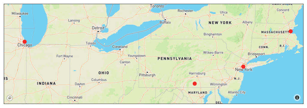
The information shown on the map above can be represented by a graph. NetworkX allows some basic customizations for how the graph is displayed.
# Draw the complete graph in networkx

cities = nx.get_node_attributes(map, 'name')
distances = nx.get_edge_attributes(map,'distance')

plt.figure(figsize=(12, 12))
pos=nx.circular_layout(map)

nx.draw_networkx_nodes(map, pos, node_size=1500, node_color='#2efa00')
nx.draw_networkx_edges(map, pos,  connectionstyle="arc3,rad=50")
nx.draw_networkx_labels(map, pos, labels=cities)
nx.draw_networkx_edge_labels(map, pos, edge_labels=distances, label_pos=0.4, font_size=15)

plt.show()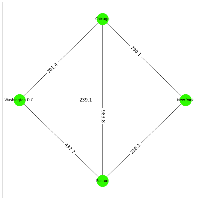
Before you proceed to the next section of the article, take a moment to reflect on the use of graphs around you. Graphs are at the heart of every social, economic, and communication network, including the internet. With graphs being used so widely, we must develop tools and algorithms for analyzing, optimizing, and making predictions about them.
Graph neural networks: An introduction
Now that we fully appreciate the need for graph and graph-based algorithms, it’s time to switch gears. Classical algorithms for graphs have existed for over a century. However, machine learning has opened up a brand new world of graph applications.
The intersection of machine learning and graph theory has led to the development of new architectures called graph neural networks (GNNs).
GNNs are a set of machine learning architectures specifically designed for operating on graphs. GNNs are very powerful and are used to solve a range of problems with state-of-the-art performance. Here are some examples:
- Graph neural networks have proven most beneficial in the field of drug discovery. Recently, DeepMind announced AlphaFold (based on GNNs) which solved a long-standing protein folding problem.
- Major recommendation systems use some kind of GNNs (e.g., PinSage of Pinterest).
- GNN-based optimization methods are used for energy distribution in a power grid for reducing carbon emissions.
Each of these graph tasks/problems falls into one of three broad categories:
- Graph level task: Classify/predict something about the whole graph (e.g., predicting the reactivity/toxicity of a molecule).
- Edge level task: Predict the link between two nodes in a graph (e.g., predicting whether two people in a social network are friends).
- Node level task: Classifying a single node or predicting the features of a node based on its edges and neighboring nodes (e.g., predicting new items a user might be interested in buying).
Most of the applications of graph neural networks fall under or revolve around any three of these tasks. As a small exercise, try figuring out what task category your favorite applications of GNNs fall into.
In the upcoming sections, we will look in detail at how to design a graph neural network that can solve these tasks.
Basic ingredients of a GNN
A neural network is a computational learning algorithm inspired by neurons in the human brain that takes an input, processes it through a network of learnable functions, and provides an output.
Neural networks have different architectures with different input and output formats. Some neural networks accept text as input and some take images. GNNs can simply be defined as neural networks that can learn and infer on graphs.
On the surface, a GNN behaves like any other machine learning algorithm. A graph neural network:
- Takes graphs as input,
- Learns about the input graphs (during training)
- Predicts/classifies on a new graph (after training).
Though it sounds similar to any other neural networks we use on text, speech, or images, there’s a small difference. Graphs are all about structure and connectivity. The connectivity of a graph defines how the node pairs are connected. As such, it makes sense to design a learning method that preserves the structure and connectivity of the graph. In simple terms, there’s no addition or deletion of edges.
With all this in mind, here’s our improved definition of graph neural networks:
A graph neural network is an algorithm that accepts a graph as an input and returns a graph by applying transformations on the vertex, edge, and global (graph-level) information without affecting its structure.
Contrary to sequential data or image data, graphs do not have a predefined structure. In an image, a pixel is connected to two or four neighboring pixels at 90 degrees. In text data, a word is followed and preceded by another word.
On the other hand, an abstract graph can contain an arbitrary number of nodes, where each node can be connected to any number of nodes. While text/image-specific neural network architectures utilize the fixed structure of text and images, a graph neural network learns from any structure of the given graph.
We can easily create architecture that accepts graphs with a fixed number of nodes and edges. These kinds of architectures have a severe problem in scaling. If we train such a network on 10,000 nodes, we cannot use that neural network for a graph of 100 or 1,000,000 nodes. The network will essentially lose the generality that comes with graphs. An ideal GNN should be able to accept arbitrarily large graphs without any change in architecture.
To address this problem, we need to understand how the information in a graph (i.e., node, edge, global, and connectivity) are stored. Understanding the underlying data structures for storing this information is also crucial for designing the internal functions of GNNs (which will be discussed later).
Graph representations: Under the hood
There are a finite number of nodes and edges in a graph, so each node/edge can be indexed by an integer. Also, each node/edge contains certain features.
In our previous example, we have seen how each node has x and y coordinates as features, whereas the edges have distance as features. We can represent these nodes/edges as a list of indexes coupled with their corresponding feature vectors.

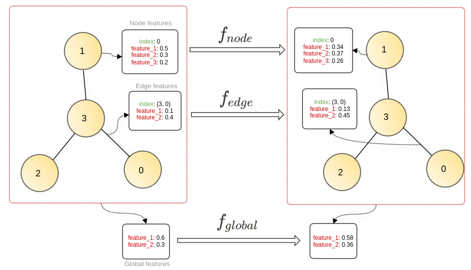
This representation, however intuitive, has a major downside to it: It’s very inefficient in terms of memory. We need a much more efficient representation for storing data. We can store the node, edge, and global information as separate feature matrices: N, E, and G. All node information is packed together into the feature matrix. For each node ni, the feature vector (embedding) is N[I, :].

We can use a similar representation for edges. For global features, we can use a single feature vector G.
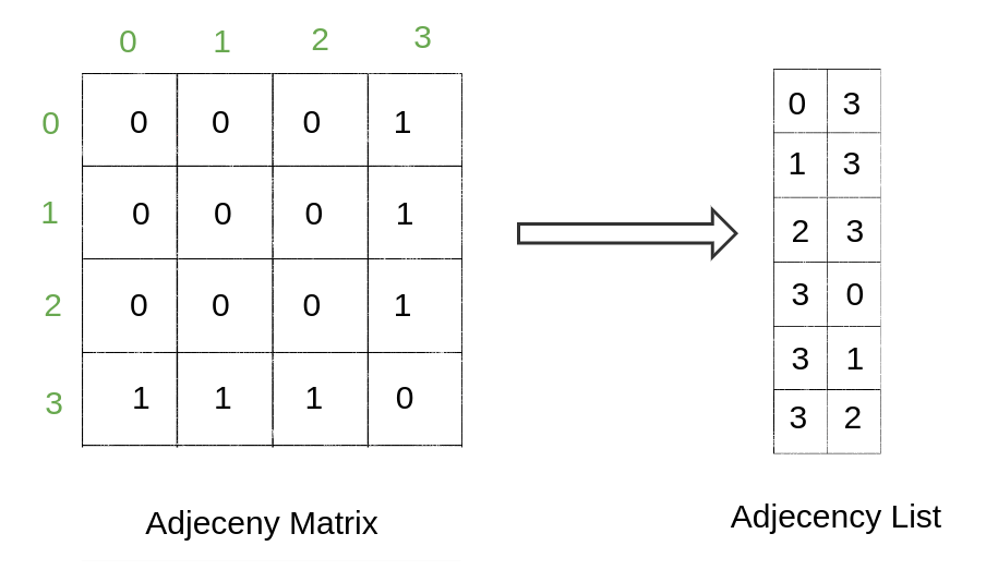
Representing connectivity in a graph is a bit different from other features. One of the most prevalent ways to depict this information is the adjacency matrix.
The adjacency matrix (A) is a simple way of representing graph connections in a matrix form where if the nodes i and j are connected, A [i, j] is 1. If they are not connected, A [i, j] is 0. In the case of weighted/directed edges, values of A [i, j] can vary.
In real-life graph data, most of the node pairs are not directly connected by an edge. So, the resulting adjacency matrix is sparse, so we can further reduce its memory usage. We use adjacency lists instead of an adjacency matrix. The adjacency list, as the name suggests, is a list of tuples (i and j) where nodes i and j are connected by an edge. The kth element of the list corresponds to the kth edge of the edge matrix.
Graphs, as we see, can be efficiently represented by matrices. Matrix operations are generally highly optimized. Therefore, this matrix representation allows for faster training and inference on graphs.
Notes:
- There are tradeoffs associated with using an adjacency matrix or adjacency lists. For a detailed discussion, check out this StackOverflow answer.
The graph information matrices can be stored/operated using Python libraries such as NumPy, Jax, PyTorch, and TensorFlow. Most graph libraries/frameworks in Python are developed on top of these matrix libraries.
Designing your first GNN
There are two main important aspects to a graph:
- Node/edge/global features/embedding and attributes
- Graph connectivity represented using adjacency list/edge indices
As discussed earlier, the GNN transforms the node/edge/global features. So we can use three different functions — f_node, f_edge, and f_global — that transform the embedding spaces. These functions are shared across all the embeddings, i.e., the same node function f_node is used to update all the nodes in a graph.
The feature/embedding for each node or edge is consistent across a graph. The three transformation functions used in our architecture take a vector of features and update it. This transformation function can be manually designed for every graph, but we’ve seen how in classical machine learning a multilayer perceptron (MLP) can serve as a good approximation for such functions.
A multilayer perceptron, or MLP, is a fully connected feed-forward neural network sometimes hailed as the universal function approximator. So, in our case, the three transformation functions are nothing but simple MLPs:
The architecture that we’ve discussed has only one level of transformation. If we want to include more layers of transformation, we can add similar layers with each layer having a different set of transformation functions (MLPs).
Note:
- Remember that the structure of the graph (represented by the adjacency list) remains unaffected.
- Updating the node, edge, and global features independently satisfies our GNN definition but it only makes use of features of a graph. We miss out on the connectivity of the graph. We still need methods that can take connectivity into consideration.
Now that we’ve formalized our most basic graph neural network, let’s see how we can use it for node classification using PyTorch Geometric.
Graph neural networks using PyTorch Geometric (PyG)
In this section, we’ll learn how to use PyTorch Geometric for creating the GNN architecture, which we formalized above. Before we do that, let’s explore the dataset/problem statement that we’re trying to solve using GNNs. This tutorial was largely inspired from existing PyTorch tutorials.
Zachary’s karate club
Zachary’s karate club dataset is one of the most popular graph datasets on the internet. The dataset contains 34 members of the club, along with information about how those members interact with one another outside the club.
After a certain period, a conflict developed between administrator John A (pseudonym) and instructor Mr. Hi (pseudonym). As a result, the club was split in half. Members of one half-formed a new club around Mr. Hi, while members of the other half changed instructors or gave up karate.
Our task is to classify which members joined which of the two daughter clubs. The task proposed by Zachary was to find which members remained with Mr. Hi.
Later, Brandes et al. proposed modularity-based clustering subdividing the network to four different communities. The clustering result has been well-accepted and is used for benchmarking GNNs rather than the original dataset. In this tutorial, we’ll be classifying which of the four sub-communities each node (member) belongs to.
Note: More information about Zachary’s karate club example can be found on Wikipedia and in Zachary’s paper.
We will be using PyTorch Geometric, a library built upon PyTorch for creating and training GNNs in this tutorial. It’s one of the most used graph deep learning libraries packed with a bunch of features that make training graph neural networks easier. It also contains some benchmark datasets (including Zachary’s karate club).
The tutorial presented in the next section of this article is largely inspired by Matthias Frey’s notebook. You can follow this tutorial in the Google colab.
To set up your code locally, you need to install two libraries: Torch and PyTorch-Geometric. Both libraries have different versions and hardware dependencies.
It’s recommended to follow the official instructions from their respective websites, where you can select optimal hardware, choice of installer (Pip or Cuda), your operating system, etc. There are essentially two steps to install locally:
- Go to the official PyTorch installation page and PyTorch Geometric page, select your choice of hardware and package, and run the installation command. Make sure you’re using the previous virtual environment created in the first half of the tutorial.
- Install the gif library (more on this library will be discussed later). If you are using Pip, the command is:
python3 -m pip install gifNote: Apple Silicon is not yet fully supported for PyTorch and related libraries. So, if you’re using M-Series chips, you might face some issues installing or running this tutorial locally.
Now that we have everything set up, let’s start importing required libraries and functions.
import networkx as nx
import matplotlib.pyplot as plt
from sklearn.manifold import TSNE
import gif

import warnings
warnings.simplefilter(action='ignore', category=FutureWarning)

# settings
%matplotlib inline
plt.style.use("seaborn")
gif.options.matplotlib["dpi"] = 300
The KarateClub dataset is provided by default in TorchGeomtric. There are various other sources, such as the UCI Network Data Repository, where you can download the data.
# Import the karate club
# Also make sure to check out the other datasets available under `torch_geometric.datasets`
from torch_geometric.datasets import KarateClub

dataset = KarateClub()
print(f'Dataset: {dataset}:')
print('======================')

# There can be one or more number of graphs in a dataset
# In this case it is only 1.
print(f'Number of graphs: {len(dataset)}')
print(f'Number of features: {dataset.num_features}')

# Node labels are the labels of the community that the node ends up joining
# These labels are obtained by via modularity-based clustering
print(f'Number of classes: {dataset.num_classes}')
Dataset: KarateClub():
======================
Number of graphs: 1
Number of features: 34
Number of classes: 4karate_club = dataset[0] # Get the dataset graph
print(karate_club)Data(x=[34, 34], edge_index=[2, 156], y=[34], train_mask=[34])Graphs in PyG are represented using a `Data` object.
Our `karate_club` `Data` object uses four different attributes to represent a graph:
- Node features: Denoted by `x`, it contains the feature matrix of the nodes. The size of `x` in this graph is `[34, 34]`, which indicates 34 nodes, each with an attribute of length 34. The attribute for each node is a one-hot vector indicating the node index.
- Adjacency lists: Denoted by `edge_index`, it contains the information about the graph’s connectivity.
- Class labels: Class labels denote which class each node belongs to.
- Train mask: `train_mask` indicates the nodes to which we already know the community they belong. The train set contains one node from each class of the dataset. The dataset has four classes, so the train set contains four points which belong to four different classes.
These attributes are enough to represent the data we have at hand, but sometimes we also need to know some basic properties of the graph, e.g., is the graph directed or undirected?
PyG provides some basic functions to interact with the data. Let’s take a peek into the data stored in the graph.
# Let us first check if the graph is directed or undirected.
print(f'Karate Club graph is undirected: {karate_club.is_undirected()}')
Karate Club graph is undirected: TrueNote: PyG doesn’t differentiate between directed and undirected graphs. If it’s an undirected graph, the edge index is reversed and appended.
It’s also important to note that any array-like data in PyTorch is stored as `torch.Tensor`. It’s like PyTorch’s own version of NumPy array. Tensors are also simple n-dimensional arrays like NumPy but with some extra features. One of the most notable features of torch tensors is that they are used for computation on GPU, unlike NumPy arrays.
You can read more about tensor in the official documentation.
# Let us have a look at the connections in the graph.
edge_index = karate_club.edge_index
print(edge_index.t())
tensor([[ 0, 1],
[ 0, 2],
[ 0, 3],
[ 0, 4],
[ 0, 5],
[ 0, 6],
[ 0, 7],
...
[33, 28],
[33, 29],
[33, 30],
[33, 31],
[33, 32]])
]])Like all other attributes, PyG stores the connectivity data in a torch tensor. Each element of the matrix is a set of two connected indexes of nodes. For more information, refer to the graph representation section of the article.
Let’s have a look at the feature matrix of the graph.
feature_mat = karate_club.x

print("Feature matrix:")
print(feature_mat)

print("\nFeature vector for node 0:")
print(feature_mat[0])
Feature matrix:
tensor([[1., 0., 0., ..., 0., 0., 0.],
[0., 1., 0., ..., 0., 0., 0.],
[0., 0., 1., ..., 0., 0., 0.],
...,
[0., 0., 0., ..., 1., 0., 0.],
[0., 0., 0., ..., 0., 1., 0.],
[0., 0., 0., ..., 0., 0., 1.]])
Feature vector for node 0:
tensor([1., 0., 0., 0., 0., 0., 0., 0., 0., 0., 0., 0., 0., 0., 0., 0., 0., 0.,
0., 0., 0., 0., 0., 0., 0., 0., 0., 0., 0., 0., 0., 0., 0., 0.])Now, let’s see the assigned class labels of the nodes.
labels = karate_club.y
print(labels)
tensor([1, 1, 1, 1, 3, 3, 3, 1, 0, 1, 3, 1, 1, 1, 0, 0, 3, 1, 0, 1, 0, 1, 0, 0, 2, 2, 0, 0, 2, 0, 0, 2, 0, 0])# Train and test split
print("Training mask:")
print(karate_club.train_mask)
Training mask:
tensor([ True, False, False, False,  True, False, False, False,  True, False,
        False, False, False, False, False, False, False, False, False, False,
        False, False, False, False,  True, False, False, False, False, False,
        False, False, False, False])
print(f'Total number of nodes: {karate_club.num_nodes}')
print(f'Number of training nodes: {karate_club.train_mask.sum()}')
print(f'Training node label rate: {int(karate_club.train_mask.sum()) / karate_club.num_nodes:.2f}')Total number of nodes: 34
Number of training nodes: 4
Training node label rate: 0.12Next, let’s visualize the community graph. We’ll be using the NetworkX `draw_networkx` function to draw the graph.
def visualize_graph(G, color):
    plt.figure(figsize=(7,7))
    plt.xticks([])
    plt.yticks([])
    nx.draw_networkx(G, pos=nx.spring_layout(G, seed=42), with_labels=True,
                     node_color=color, cmap="Set2")
    plt.show()
from torch_geometric.utils import to_networkx
# Convert the PyG graph to NetworkX graph
G = to_networkx(karate_club, to_undirected=True)
visualize_graph(G, color=karate_club.y)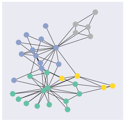
Creating the PyTorch Model
Creating your PyTorch models is very easy and come down to two easy steps:
- Initialize building blocks (including flags, variables and layers) in ` __init__` function.
- Define how the computation is performed in the `forward` layer.
If this is your first time defining your models using PyTorch, check out this 60-minute blitz from PyTorch. PyTorch-Geometric(PyG) extends PyTorch for graphs. PyG exports graph-specific layers and modules which can easily be composed with other PyTorch modules and layers.
The model we’re trying to develop is very basic, so we won’t require any special functions from PyG. Our model is a two-layered MLP with dropout and non-linearities, which accept a graph and apply transformation to the node features.
import torch
from torch.nn import Linear, Dropout, Tanh, ReLU # import the torch layers
torch.manual_seed(140) # for reproducibility
# Define your own model
class MLP(torch.nn.Module):
def __init__(self, in_channels: int, hidden_channels: int, out_channels: int):
super(MLP, self).__init__()
self.embed = Linear(in_channels, hidden_channels)
self.classifier = Linear(hidden_channels, out_channels)
self.activation = ReLU()
self.dropout = Dropout(0.5)
def forward(self, graph):
x = graph.x
x = self.embed(x)
h = self.activation(x)
h = self.dropout(h)
x = self.classifier(h)
return x, hThe MLP consists of two `torch.nn.Linear` layers: the first layer projects the node features to an embedding vector and the second layer classifies the node from the embedding vector.
To be able to learn more complex features, it’s standard practice to introduce non-linearity into our network. Neural networks derive their superpower from their non-linear nature. See this StackOverflow answer to gain more insight into this matter.
So, after two Linear layers, we apply a nonlinear function ReLU(Rectified Linear Unit) and dropout (to reduce overfitting) on the embedding output before it’s passed to the classifier layer.
Let’s initialize the model using the dataset-specific information:
model = MLP(dataset.num_features, 16, dataset.num_classes)
print(model)
MLP(
(embed): Linear(in_features=34, out_features=8, bias=True)
(classifier): Linear(in_features=8, out_features=4, bias=True)
(activation): ReLU()
(dropout): Dropout(p=0.2, inplace=False)
)Inspired by this PyG tutorial, we visualize how the embedding vector looks for the graph in two dimensions. We’ll be using a TSNE method from the Scikit-learn library to project a larger dimension (16) to a lower dimension (2). This method can be used to visualize how effectively the network can separate the four classes. We’ll be discussing more on this shortly.
Additionally, we want to visualize the entire training process, so we save the embedding plot for each training step and compile all of them into a gif. Here, the gif library’s `gif.frame` decorator comes in handy, which returns a plot as a Python image object frame so that it can be saved as a gif later.
@gif.frame
def visualize_embedding(h, color, epoch=None, loss=None, acc=None):
    plt.figure(figsize=(7,7))
    plt.xticks([])
    plt.yticks([])
    z = TSNE(n_components=2).fit_transform(h.detach().cpu().numpy())
    plt.scatter(z[:, 0], z[:, 1], s=140, c=color, cmap="Set2")

    if epoch is not None and loss is not None and acc is not None:
        plt.xlabel(f'Epoch:use, Loss: {loss.item():.4f}, Acc: {acc.item():.4f}', fontsize=16)
Now, let’s visualize the embedding plot before training.
out, h = model(karate_club)
print(f'Embedding shape: {list(h.shape)}')

plt.figure(figsize = (8,8))
fig = visualize_embedding(h, color=karate_club.y)
plt.figure(figsize = (8, 8))
plt.imshow(fig)
plt.axis('off')
plt.show()
Embedding shape: [34, 16]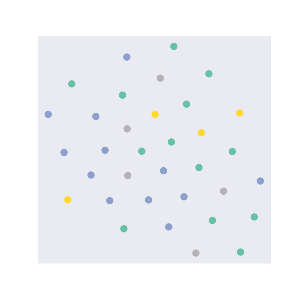
Our 16-dimensional embedding space has been reduced to a 2-dimensional embedding space. Here, the four different coloured dots represent four different classes.
In an ideal situation, where the model is able to classify the nodes properly, the 2D embedding for different classes will be separated from one another and the same classes should be close to each other on the embedding space. The ideal embedding space should look like four different non-overlapping colored clusters.
Note: Our model is initialized randomly, so the embedding function is also random. If you’re running it locally, it’s possible to get a plot different from the one given here. Similarly, you can get different initial accuracies for the model.
We define an accuracy function to measure the number of correct labels. Our model predicts embedding alongside unnormalized probabilities /logits for the different classes. We use `torch.argmax` to find the class with the maximum probability.
def accuracy(logits, labels):
    # find the accuracy
    pred = torch.argmax(logits, dim=1)
    acc = torch.mean((pred == labels).float())
    return acc
init_acc = accuracy(out, karate_club.y).item() * 100
print(f"The initial accuracy {init_acc:0.03} %")The initial accuracy 11.8%Note: As discussed above, the model is initialized with random weights, so the initial result might differ from the presented here. The model will give different accuracies each time the model is reinitialized. The final results after the training of the model also might slightly differ from our result due to this random initialization.
Our model returns the results on a node as logits. Logits can roughly be considered as unnormalized probabilities. We’ll be comparing the logits output from the model to the ground truth/probabilities. To do so, we need a measure.
For example, to compare two decimal numbers, we use the difference as a measure. Here, we need a measure to compare two probabilities.
Thankfully, torch’s CrossEntropyLoss comes to the rescue that compares probabilities based on mutual entropy. So, like any other classification model, we use CrossEntropyLoss as the measure to optimize our model.
We also use an optimizer called ADAM for controlling the learning rate throughout the learning training process for a smoother convergence of the loss. See this Machine Learning Mastery article to understand more about ADAM and optimization.
There is, however, a subtle difference in using training data. In image or text classification, we generally split the data into training, validation, and test datasets, after which we use only the training split during training. We follow a transductive learning technique where the model observes all the data beforehand. Refer to this Toward Data Science article to learn more about transductive learning.
Now let’s get to training the model.
model = MLP(dataset.num_features, 8, 4) # Define our MLP model
criterion = torch.nn.CrossEntropyLoss() # Define loss criterion.
optimizer = torch.optim.Adam(model.parameters(), lr=0.01) # Define optimizer.
def train(data):
optimizer.zero_grad()
out, h = model(data)
loss = criterion(out[data.train_mask], data.y[data.train_mask]) # Compute the loss solely based on the training nodes.
acc = accuracy(out[data.train_mask], data.y[data.train_mask])
loss.backward()
optimizer.step()
return loss, h, acc
frames=[]
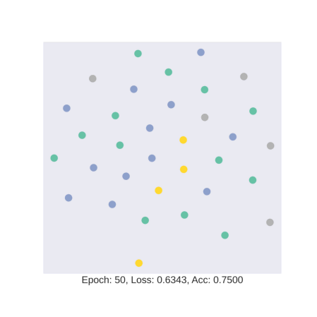
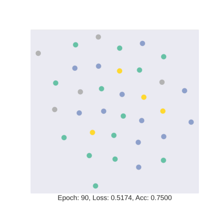
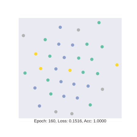
for epoch in range(180):
loss, h, acc = train(karate_club)
if epoch % 10 == 0:
fig = visualize_embedding(h, color=karate_club.y, epoch=epoch, loss=loss, acc=acc)
frames.append(fig)
plt.figure(figsize = (8, 8))
plt.imshow(fig)
plt.axis('off')
plt.show()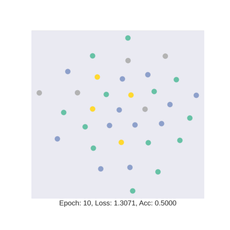
Next, let’s visualize how the embedding changes with each training.
gif.save(frames, "mlp.gif",
         duration=15)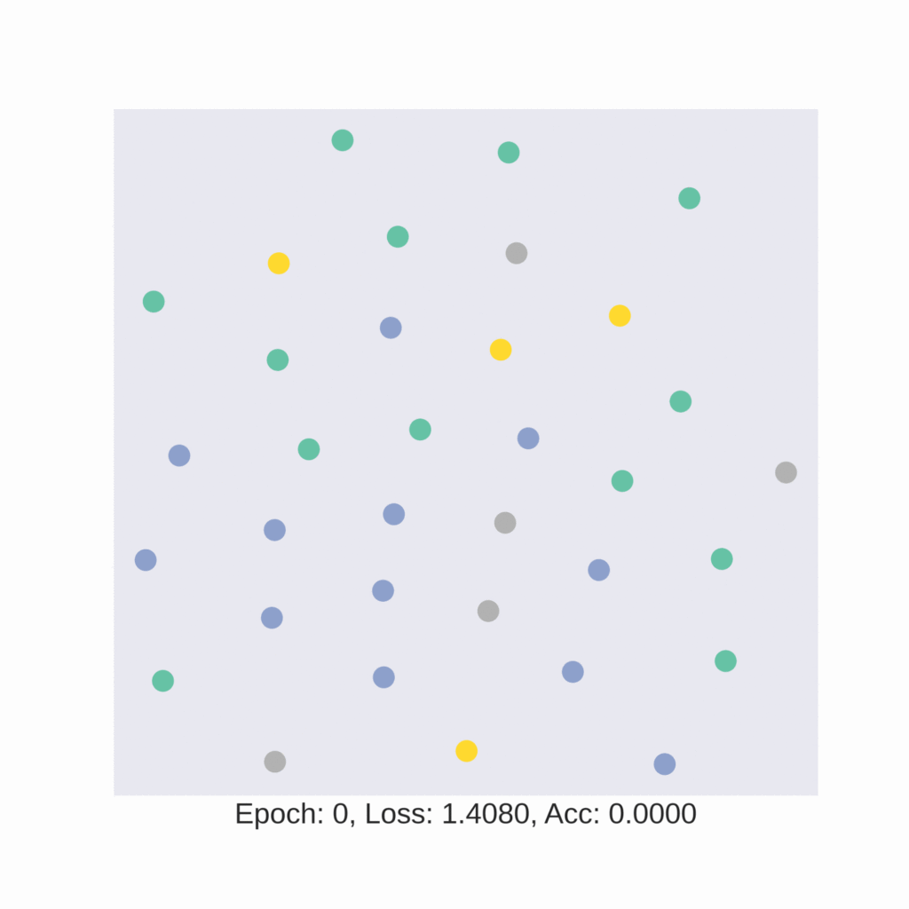
As discussed earlier, the model tries to learn an embedding function. This embedding function tries to segregate nodes of different classes in separate clusters.
In this gif, we see how the embedding space changes as we train our model with four colors representing four different classes in the data. We see that our model is hardly able to segregate test data into specific clusters.
Our training accuracy and the corresponding embedding space look like a case of overfitting. Overfitting in statistics is defined as the situation where the model fits exactly against its training data resulting in degraded performance on data that it has not seen before. This is an expected phenomenon here as our deep learning model has been trained with only four nodes with a node each from four classes present in the dataset. So, let’s test the rest of the dataset.
train_accuracy = accuracy(model(karate_club.x, karate_club.edge_index)[0][karate_club.train_mask], karate_club.y[karate_club.train_mask])

test_accuracy = accuracy(model(karate_club.x, karate_club.edge_index)[0][~karate_club.train_mask], karate_club.y[~karate_club.train_mask])


total_accuracy = accuracy(model(karate_club.x, karate_club.edge_index)[0], karate_club.y)

print(f"Train accuracy: {train_accuracy * 100:0.03} %")
print(f"Test accuracy: {test_accuracy * 100 : 0.03} %")
print(f"Dataset accuracy: {total_accuracy * 100 : 0.03} %")
Train accuracy: 1e+02 %
Test accuracy: 30.0 %
Dataset accuracy: 32.4 %Going forward
Our model doesn’t perform that well for this task. One of the main reasons is that each node barely contained any information except the node number as a one-hot form.
As we said earlier, friends are likely to join the same club. The crucial edge information remained unused in our basic network. This edge information can be used by algorithms such as Graph Convolution or GCN. Try replacing the `torch.linear` layers with `torch.GCNConv` layers and see how the embedding space is altered by the network. The code for GCN can be found in the attached Colab.
After running the same model with GCN, we see the following accuracy readout:
Train accuracy: 1e+02 %
Test accuracy:  80.0 %
Dataset accuracy:  82.4 %
Conclusion
In this tutorial, we’ve learned the basics of graphs and how to design basic graph neural networks. Now, it’s time to put your learning to use and try your hand at designing GNNs of your own.
If you like articles like this, browse the Mattermost Library for more tutorials on how to use modern technologies to optimize software development workflows and build powerful applications.